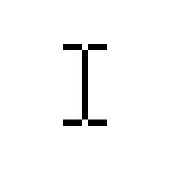
 When your cursor is over text that can be selected, it sometimes turns into something like a capital I with serifs (that is, the bits on the top and bottom). Why is this? It’s said that the cursor turns into this I-like symbol, often called an “I-beam,” because it represents “insert,” or “insertion point,” which is what you are often doing when clicking on text.
This explanation is certainly probable, but I’ve always thought the I represented the type guide on a typewriter, which is often two metal bits coming very close together. Since these days the cursor goes between letters (“insert” used to select a letter by inverting the whole block, like what happens when you highlight one), it makes sense to have the selection part be a line rather than a gap. This was suggested to me by the fact that most I-beam cursors leave a pixel off the top and bottom of the vertical bar to give it a rounded look, maybe of two shapes pushing together. But this is only my own speculation on the matter.